Get Spice Up Your Blog Sharing Widget for blogger blogs at free of cost

Hi guys as every one knows these days the Spice Up Your Blog sharing widget or subscriber widget for the blogs are very hot to be seen and look well equipped social box with some cool subscription rates going high well with this post you can also get the same kind of sharing widget as shown in the image beside even at your blog. This sharing has got cool rotating option at their same position using some jQuery Effect.

To do this you just need to follow these two below steps to get the box live at your blog.

3D Animations Using three.js - An Overview!

3d-animations
It's been a long time since I had my hands on this blogger dashboard. In other words, the last article which I wrote dates back to the month of November 2011. Reason - I just did not find time to catch up with my blog. However, I could not resist myself to write about something that astonished me a couple of days ago - three.js!

This JavaScript works flawlessly and provides us a smooth interface which web developers could exploit to create amazing 2D and 3D animations with Canvas. Few words from the creators of three.js - 
"The aim of the project is to create a lightweight 3D engine with a very low level of complexity; in other words, for dummies. The engine can render using <canvas> and WebGL."

Background Animations On Blogger Using Jquery

background-animation-blogger
Recently, I came across a website in which the header had an animated background - dynamically moving image. I thought, why not try to achieve a similar effect on blogger. I worked out the codes, to be honest, it was quite simple. So, in this article, I've explained the basic idea behind animating backgrounds using jquery. If you intend to apply the same effect on your header, then reach us via the services tab.

BACKGROUND ANIMATION ON BLOGGER - LIVE DEMO

I suggest you to take a look at the demo, by hitting the link above, before we dive into the tutorial. I've personally test the above effect on all major browsers that include, but not limited to, IE, FF, Chrome, Safari and Opera which simply ensures a perfect browser compatible view. So, what you waiting for? Just follow the instructions below and get them installed on your blog.

1. Navigate to "Design>>Edit HTML" and make a backup of your template by clicking on the "Download full template" link at the top of the page. Once the back up is over, search for the following piece of code.
]]></b:skin>
2. Just replace the above code with the following code present in the text document - SCRIPT AND CSS FOR BACKGROUND ANIMATION. The code in the text document contains the CSS and JavaScript required to run the animation. If you already have the main jquery file running on your blog, then remove the line which contains it from the text document. To remove it, just delete the following line from the text document.
<script src='http://ajax.googleapis.com/ajax/libs/jquery/1.6.2/jquery.min.js' type='text/javascript'/>
3. Next, place the following HTML tags anywhere on your template - possibly before/above <div id='content-wrapper'> (or) <div class='columns fauxcolumns'> (or) you may use them in the blogger post editor, just like I did in the demo link.
<div id="animate-area">
</div>
4. That's it! Save your template and your done!

I hope the tutorial was pretty simple to understand and work on. If you find any difficulties in getting the animation working, then leave a comment below and get it solved. As usual, share your opinions via comments below.

Distortion Effect On Images Using CSS & Jquery

Distortion-effect
Inspired by few works from Ryan Florence - Mootools contributor and moo4q creator, I wanted to use few scripts from his animation library to create a stunning effect for users on blogger/WordPress(WP), namely "the distortion effect" on images using CSS and jquery. I've split the tutorial into 3 parts - HTML, CSS and JavaScript to keep it simple. So, take a look at the live demo using the link below.

DISTORTION EFFECT ON IMAGES - LIVE DEMO

CSS
1. Navigate to "Design>>Edit HTML" and make a backup of your template by clicking on the "Download full template" link at the top of the page. Once the back up is over, search for the following piece of code.
]]></b:skin>
2. Add the following piece of code just above/before the line mentioned in step 1.
a#homeLogo  {
  width:300px;
  height:233px;
  text-indent:-3000px;
  background:url(https://lh6.googleusercontent.com/-d6KcE0bYt7g/TmB-678StqI/AAAAAAAABiQ/8HiKcJYL3RY/s800/face-icon.png) 0 0 no-repeat;
  display:block;
  z-index:2;
}
a#homeLogo span {
  float:left;
  display:block;
  background-image:url(https://lh6.googleusercontent.com/-d6KcE0bYt7g/TmB-678StqI/AAAAAAAABiQ/8HiKcJYL3RY/s800/face-icon.png);
  background-repeat:no-repeat;
}
.clear { clear:both; }
Note: Users on WP may add the above mentioned codes to their custom.css file and upload the same to their host servers.
3. Change the URL highlighted in green with the image URL of your choice. Please, try to maintain the image dimensions - 300x233px, to avoid layout issues and further complications arising out of the same:)

JAVASCRIPT
Users on blogspot/blogger may follow the following instructions. To avoid excessive time in loading your website/effect on blogger, you shall define the JavaScript internally on your blog rather than calling them from Google Sites where I hosted them.
1. Search for the following piece of code in your blogger template.
</head>
2. Paste the following piece of code mentioned in the text document - JAVASCRIPT FOR DISTORTION EFFECT, just above/before the line mentioned in step 1.

WP Users may download the files - CSSAnimation.js, CSSAnimation.jQuery.js  & Demo.js (you may define them internally) and upload the same to their host servers to include them before </head> as mentioned earlier (similar to blogspot users). I recommend you to read the following articles to better understand about adding custom defined JavaScript on WordPress - Adding JavaScript on WordPress. I'm not a WP expert. So, if there are any WP geeks out there, you may share a small tutorial about adding these scripts to their respective hosts - either via comments or via guest articles:) 

HTML
The HTML involved behind the distortion effect is pretty complex to understand. So, to keep them simple, I've just added them to a text file which you may download here - HTML FOR DISTORTION EFFECT. Now, paste the code present in the text document anywhere in your blogger template or WordPress theme - better to add them as widgets. That's it! Save your template and your done. Replace the link which points to my website (http://www.newbloggingtipz.com)with that of yours. It's pretty self-explanatory.

The above effect was tested to work on all major browsers including, but not limited to, IE, FF, Chrome, Safari and Opera. If you need any assistance in adding this effect on your blog, then leave a comment below and get it clarified. Do share your opinions about the article via comments.

Text With Moving Background On Blogger

text-moving-bg-tut
Inspired from the tutorial written by "GayaDesign" about text with moving background, I wanted to write an article so that, users on blogger/blogspot can enjoy the same effect. The article will guide you to create a text mask using PhotoShop and use the same to realize the final effect with some CSS and Jquery. I suggest you to take a look at the live demo by using the link below.

TEXT WITH MOVING BACKGROUND ON BLOGGER - LIVE DEMO

Cool... Isn't it? Well, let's get this installed on our blogs as well. I've split the tutorial in 4 parts - Photoshop, HTML, CSS and Jquery. The article is quite big. So, without wasting time, let me dive into the first phase of the tutorial straight away.

USING PHOTOSHOP TO CREATE THE MASK
1. Open a new file with the following dimensions: 600x100px (width - 600px and height - 100px). Now, pour some color using the paint brush tool. You may add some gradient shades, like I did, if you wish to make it more appealing.
2. Now, create a new layer using the icon that appears on the layers panel. I suggest you to take a look at the screen shot shown below. Now, hit the "Text/Horizontal Type Tool" and type the text of your choice on the canvas.
Photoshop-Step-2
3. Just move to the layer's panel and select the newly created text layer by holding "CTRL" key on your keyboard. You'll notice the text layer alone being selected. Just go to "Select > Inverse" using the menu-bar at the top or simply hold the keys "Shift+Ctrl+I" to select the inverse layer. You should probably have a selection similar to the one shown below.
Photoshop-Step-3
4. Now, simply select the other layer (Layer 1) in the layers panel and hit the icon that says "Add Mask Layer". Just refer to the following screen shot to better understand about the same.
Photoshop-Step-4
5. Next, hide the text layer - remove the eye icon from the layers panel. Refer to the screen shot below.
Photoshop-Step-5
6. Now, you should be able to see your masked text image as shown below. Save this image in PNG format. and upload the same to your picasa album or any image hosting site. I've saved it using Mask. So, when I refer to Mask.png anywhere in the article, it refers to this mask image.
Photoshop-Step-6
Note: The mask which you've just created using PhotoShop (Mask.png) will be used in the HTML part. It is not necessary that you maintain the image dimensions as mentioned in step 1. However, when you vary the image dimensions, you should make the corresponding changes in the CSS part as well.

HTML
1. Navigate to "Design>>Edit HTML" and make a backup of your template by clicking on the "Download full template" link at the top of the page. Once the back up is over, search for the following piece of code.
<b:section class='main' id='main' showaddelement='no'>
2. Paste the following piece of code just above the line mentioned in step 1.
<div class='scrollBg'>
<a href='http://www.newbloggingtipz.com/'><img src='Mask.png'/></a>
</div>
3. Replace "Mask.png" in the above code with the URL of the uploaded image Mask.png as mentioned earlier in the tutorial and save your template. Similarly, replace the URL pointing to my website  in the anchor tag with the one of your choice.
Note: You can add the HTML codes anywhere in your template - not necessary that you add it above the line mentioned in step 1.

CSS
1. Search for the following code in your template.
]]></b:skin>
2. Paste the following piece of code just above the line mentioned in step 1.
.scrollBg {
background-image: url(https://lh4.googleusercontent.com/-ZkujcrvGd90/TlPy4OQYwiI/AAAAAAAABgA/sAN8xE_katY/s800/love-pattern-new.png);
background-color: #000000;
width: 600px;
height: 100px;
}
.scrollBg img {
display: block;
border:2px #000 solid;
}
3. Save your template. 
Note: You may change the background image by changing the URL highlighted in green - try to maintain the image dimension as mentioned in the CSS to avoid confusions.

JAVASCRIPT/JQUERY
1. Search for the following code in your template.
</head>
2. Paste the following piece of code present in this text document - SCRIPT FOR TEXT WITH MOVING BACKGROUND, just above the line mentioned in step 1.
Note: You may omit the first line the script mentioned above provided you have the latest jquery file running on your blog.
3. That's it! Save your template and your done!

If you are a person obsessed with page speed of your blog but you like this widget, then ping me via gtalk and I'll help you out. I'll just tell you to define the JavaScript internally than fetching it from Google Sites where I hosted it. That's it:)

The above effect was tested to work perfectly fine on all the major browsers that include, but not limited to, FF, IE, Chrome, Safari and Opera. If you need further assistance in applying this effect anywhere on your blog, then leave a comment below and get it clarified. Do share your opinions about the article/effect via comments.
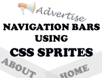
Add An Animated Tabbed Widget To Blogger

tabbed-widget-blogger
Well, we've seen so many blogs come up with tabbed widgets for blogger. What if we add some simple animations to such widgets using Jquery. Will it not make the widget and blog, more attractive and unique? I feel it should. So, in this article, I'll teach you about adding one such animated widget with ease on blogger. Take a look at the demo using the link below and we'll get started.

ANIMATED TABBED WIDGET FOR BLOGGER - LIVE DEMO

Pretty interesting, isn't it? Well, let's dive into the tutorial straight away. I'll split the article into three parts - HTML, CSS and JavaScript so that you can rather take a break as and when you need, than working out the complete tutorial at a stretch. Well, so follow these steps to get the animated tab working on your blog.

CSS
1. Navigate to "Design>>Edit HTML" and make a backup of your template by clicking on the "Download full template" link at the top of the page. Once the back up is over, search for the following piece of code.
]]></b:skin>
2. Paste the following piece of code just above the line mentioned in step 1. Save your template.
.tabbed_content {
background-color: #000000;
width: 620px;
}
.tabs {
height: 62px;
position: relative;
}
.tabs .moving_bg {
padding: 15px;
background-color:#7F822A;
background-image:url(https://lh6.googleusercontent.com/-T7SeJr4flqU/TlIxAq8lLgI/AAAAAAAABf0/DdEWFuDVGfM/s800/arrow_down_green.gif);
position: absolute;
width: 125px;
z-index: 190;
left: 0;
padding: 25px 15px;
background-position: bottom left;
background-repeat: no-repeat;
}
.tabs .tab_item {
display: block;
float: left;
padding: 15px;
width: 125px;
color: #ffffff;
text-align: center;
z-index: 200;
position: relative;
cursor: pointer;
}
.tabbed_content .slide_content {
overflow: hidden;
background-color: #000000;
padding: 10px 0 10px 20px;
position: relative;
width: 600px;
}
.tabslider {
width: 5000px;
}
.tabslider ul {
float: left;
width: 560px;
margin: 0px;
padding: 0px;
margin-right: 40px;
list-style-type:none;
}
.tabslider ul a {
color: #ffffff;
text-decoration: none;
}
.tabslider ul a:hover {
color: #aaaaaa;
}
.tabslider ul li {
padding-bottom: 7px;
}
Possible customizations include changing the list-style for the elements, background color, text color and the spacings. Please note that, I've used an image for the arrow mark. So, if you change the background color, ensure that the image showing arrow mark is also changed to match with that of the background.

HTML
1. Search for the following piece of code in your template.
<b:section class='main' id='main' showaddelement='no'>
2. Paste the following block of code just above the line mentioned in step 1.
<div class='tabbed_content'>
<div class='tabs'>
<div class='moving_bg' style='left: 155px;'/>
<span class='tab_item'>TAB TITLE</span>
</div>               
<div class='slide_content'>                       
<div class='tabslider' style='margin-left: -600px;'>
<ul>
<li><a href='#'>LINK NAME</a></li>
</ul>

<ul>
<li><a href='#'>LINK NAME</a></li>
</ul>

<ul>
<li><a href='#'>LINK NAME</a></li>
</ul>

<ul>
<li><a href='#'>LINK NAME</a></li>
</ul>
</div>
<br style='clear: both;'/>
</div>
</div>
3. Replace # at every instance with the links you wish to point to. Similarly, replace LINK NAME  at every instance with the name of your links - probably post titles. Don't forget to replace TAB TITLE with the your title for the tabs. Save your template temporarily before we add the final jquery magic.
You can add the HTML codes anywhere in your template - not necessary that you add it above the line mentioned in step 1. But, when you place them elsewhere, you need to adjust the width of the widget correspondingly in the CSS part to fit your layout.

JAVASCRIPT/JQUERY
1. Search for the following piece of code in your template.
</head>
2. Paste the following piece of code in the text document - SCRIPT FOR ANIMATED TABBED WIDGET, just above the line mentioned in step 1.
Note: You need not include the first line in the script mentioned above (the one in the text document), provided you already have the latest jquery file running on your blog.
3. Save your template and check out the animated tab running on your blog.

I've tested the above widget to work fine on all the major browsers which include, but not limited to, IE, FF, Chrome, Opera and Safari. If you need assistance in adding the same, then leave a comment below and get it clarified. Do share your opinions about the article via comments.

Collapsible Message Panels On Blogger

collapsible-effect-blogger
When I was browsing a design blog called "impressivewebs", I found a header that could collapse itself. Impressed by the effect, I sat down to work out the logic and it was pretty simple to achieve it on blogger. In this article, I'll illustrate the collapsible effect with simple message panels while you may apply the same logic to your header or post area or to any widget of your choice.

COLLAPSIBLE MESSAGE PANELS ON BLOGGER - LIVE DEMO

So, take a look at the live demo by hitting the link above. I guess you liked it... Interested to add this on your blog, as well? Then, follow the steps below.
1. Navigate to "Design>>Edit HTML" and make a backup of your template by clicking on the "Download full template" link at the top of the page. Once the back up is over, search for the following piece of code.
]]></b:skin>
2. Just paste the following piece of code above the line mentioned at step 1.
.message_list {
    list-style: none;
    margin: 0;
    padding: 0;
    width: 383px;
}
.message_list li {
    padding: 0;
    margin: 0;
    background: url(https://lh5.googleusercontent.com/-rFKQUJCuaBU/TkdtUFeNzGI/AAAAAAAABec/bn_KIzqh03c/s800/message-bar.png) no-repeat;
}
.message_head {
    padding: 5px 10px;
    cursor: pointer;
    position: relative;
}
.message_head .timestamp {
    color: #666666;
    font-size: 95%;
    position: absolute;
    right: 10px;
    top: 5px;
}
.message_head cite {
    font-size: 100%;
    font-weight: bold;
    font-style: normal;
}
.message_body {
    padding: 5px 10px 15px;
}
.collapse_buttons {
    text-align: right;
    border-top: solid 1px #e4e4e4;
    padding: 5px 0;
    width: 383px;
}
.collapse_buttons a {
    margin-left: 15px;
    float: right;
}
.show_all_message {
    background: url(https://lh3.googleusercontent.com/-SYzKGAtmZa8/TkdtUMVjh4I/AAAAAAAABeY/VXlnQnXlEQ4/s800/tall-down-arrow.png) no-repeat right center;
    padding-right: 12px;
}
.show_recent_only {
    display: none;
    background: url(https://lh6.googleusercontent.com/--99zjaBlqYY/TkdtURvdWRI/AAAAAAAABeg/Z8Yismgt5YY/s800/tall-up-arrow.png) no-repeat right center;
    padding-right: 12px;
}
.collpase_all_message {
    background: url(https://lh4.googleusercontent.com/-_mvlatWt3m4/TkdtUCz8LII/AAAAAAAABeU/mctqJi0fkbs/s800/collapse-all.png) no-repeat right center;
    padding-right: 12px;
    color: #666666;
}
Note: I've used an image for the title part of the image. You may replace the same with gradient colors using CSS. Refer the following article to do the same - Cross-Browser Gradient Effect Using CSS.
3. Next, search for the following piece of code.
</head>
4. Paste the following piece of code just above the line mentioned in step 3. Save your template.
<script src='http://ajax.googleapis.com/ajax/libs/jquery/1.6.2/jquery.min.js' type='text/javascript'/>
<script type='text/javascript'>
$(document).ready(function(){
    //hide message_body after the first one
    $(&quot;.message_list .message_body:gt(0)&quot;).hide();
    //hide message li after the 5th
    $(&quot;.message_list li:gt(4)&quot;).hide();   
    //toggle message_body
    $(&quot;.message_head&quot;).click(function(){
        $(this).next(&quot;.message_body&quot;).slideToggle(500)
        return false;
    });
    //collapse all messages
    $(&quot;.collpase_all_message&quot;).click(function(){
        $(&quot;.message_body&quot;).slideUp(500)
        return false;
    });
    //show all messages
    $(&quot;.show_all_message&quot;).click(function(){
        $(this).hide()
        $(&quot;.show_recent_only&quot;).show()
        $(&quot;.message_list li:gt(4)&quot;).slideDown()
        return false;
    });
    //show recent messages only
    $(&quot;.show_recent_only&quot;).click(function(){
        $(this).hide()
        $(&quot;.show_all_message&quot;).show()
        $(&quot;.message_list li:gt(4)&quot;).slideUp()
        return false;
    });
});
</script>
Note: Do not include the first line in the script mentioned above if you've already added the latest jquery file on your blog.
5. Now, paste the following piece of code in the document - HTML FOR COLLAPSIBLE EFFECT, anywhere inbetween your <body> and </body> tags - probably within the post editor (or) below <div class='main-wrapper'> (or) <div class='columns fauxcolumns'>.
6. That's it! Save your template or publish the article and view the same to enjoy the effect.

HTML CUSTOMIZATION - FOR CODE MENTIONED IN STEP 5
If you wish to generate the time for your messages (displayed at the top right) by default, then change the text that appears in between  <span class="timestamp"> and  </span> tags. Similarly, you can change the text from "NAME" and "CLIENT" with your names and clients respectively. I've added my name and a small message in the first few div tags for reference. Check the same (code mentioned in text document at step 5) for your reference.

I've tested the above effect on all the major browsers which includes, but not limited to, IE, FF, Chrome, Safari and Opera. Let me know if you find some bugs with the above coding. If you need assistance in extending this effect to other elements on your blog, then leave a comment below and I'll help you out when I'm free:) Do share your opinions about the article via comments!

Shutter Effect Image Slider/Gallery On Blogger

I've been constantly trying to pull out unique articles for blogs run on blogger. I'm sure you would have noticed the same provided you are a constant follower of my blog. So, we've yet another interesting article based on jQuery, called the "Shutter Effect for the Images On Blogger", inspired from tutorialzine. Just take a look at the live demo of the effect by hitting the link below and we'll get started...

SHUTTER EFFECT ON BLOGGER - LIVE DEMO

Interesting effect... Isn't it? I would suggest the above effect for blogs based on photography. While, webmasters and web designers can use the above effect to showcase their portfolios. I'm sure there are lots more places wherein you can use the above effect. So, I'm open to your suggestions... Well, let's get started with the tutorial.

JAVASCRIPT/JQUERY
1. Navigate to "Design>>Edit HTML" and click on the "Download full template" link at the top of the page. Once the back up is over, search for the following code in your template.
</head>
2. Paste the code present in the following text document - Jquery For Shutter Effect, just above the line mentioned in step 1.
3. That's it! Save your template temporarily.

HTML
1. Look out for any one of the following codes in your template.
<div id='content-wrapper'>
(or)
<div class='columns fauxcolumns'>
(or)
<div id='main-wrapper'>
2. Paste the following code just below the code, you searched for, in step 3.
<div id='container' style='position: relative;'>
<ul>
<li style='display: none;'>
<img height='450' src='IMAGE URL' width='600'/>
</li>
<li style='display: none;'>
<img height='450' src='IMAGE URL' width='600'/>
</li>
<li style='display: list-item;'>
<img height='450' src='IMAGE URL' width='600'/>
</li>
<li style='display: list-item;'>
<img height='450' src='IMAGE URL' width='600'/>
</li>
</ul>
<div class='shutterAnimationHolder' style='width: 600px; height: 450px; display: none;'>
<div class='film' style='height: 15000px; width: 1000px; margin-left: -500px; top: -300px;'>
<canvas height='1000' width='1000'/><canvas height='1000' width='1000'/><canvas height='1000' width='1000'/><canvas height='1000' width='1000'/><canvas height='1000' width='1000'/><canvas height='1000' width='1000'/><canvas height='1000' width='1000'/><canvas height='1000' width='1000'/><canvas height='1000' width='1000'/><canvas height='1000' width='1000'/><canvas height='1000' width='1000'/><canvas height='1000' width='1000'/><canvas height='1000' width='1000'/><canvas height='1000' width='1000'/><canvas height='1000' width='1000'/>
</div>
</div>
</div>
(Note: It is not necessary that you place the above code below those lines mentioned in step 3. You can place them anywhere in your template. If you end up with some layout issues or bugs, then leave a comment below.)
3. Replace "IMAGE URL" with the URL of your images - image dimensions shall be 600x450px. Save your template again.
4. If you wish to change the width and height of the images (600x450px), then you need to change the codes highlighted in blue mentioned at step 2.

CSS
1. Search for the following code in your template. 
]]></b:skin>
2. Add the following piece of code just above the line mentioned in step 1.
#container{
    width:600px;
    height:450px;
    margin:0 auto;
    border:5px solid #fff;
    overflow:hidden;
    -moz-box-shadow: 0 0 10px rgba(0, 0, 0, 0.3);
    -webkit-box-shadow: 0 0 10px rgba(0, 0, 0, 0.3);
    box-shadow: 0 0 10px rgba(0, 0, 0, 0.3);
    margin-bottom:5px;
}

#container ul{
    list-style:none;
    margin-top:0px;
}
.shutterAnimationHolder .film canvas{
    display: block;
    margin: 0 auto;
}
.shutterAnimationHolder .film{
    position:absolute;
    left:50%;
    top:0;
}
.shutterAnimationHolder{
    position:absolute;
    overflow:hidden;
    top:0;
    left:0;
    z-index:1000;
}
3. Save your template and we're done. 
Just in case you customized the image or in other words, followed the step 4 in HTML part, then change the codes highlighted in green mentioned at step 2. If not, just neglect this step and check out the stunning effect on your blog.

The above effect was tested to work perfectly fine on all the major browsers that include, not limited to, FF, Chrome, Opera and Safari. If you find the HTML part difficult to customize, then you may refer to the following text document for the coding that I used on the demo blog - Reference for Shutter Effect. Share your opinions via comments!

Changing Backgrounds Dynamically On Blogger Using Jquery

change-bg-dynamically
I've been quite busy over the past few weeks with my clients and articles on SML. Today, I found sometime to work out a simple trick based on Jquery - Changing Backgrounds Dynamically. Well, I hope you read the article about "Adaptable View On Blogger" wherein, I mentioned we can tweak the design of our blog dynamically. We'll be using the same concept in this article as well...

I don't want to take too much of your time. So, I'll just explain the basics about the working of the script. The script will add or remove classes to the body element based on what list item the user clicks on. That's it. So, take a look at the demo of this simple effect by visting the link below and we'll get started...

CHANGING BG COLOR DYNAMICALLY - LIVE DEMO

1. Navigate to "Design>>Edit HTML" and make a backup of your template by clicking on the "Download full template" link at the top of the page. Once the back up is over, search for the following piece of code.
]]></b:skin>
2. Paste the following piece of code just above the line mentioned step 1.
.bg1 { background: url(BG IMAGE URL) repeat-x; background-color: #6c0000; }
.bg2 { background: url(BG IMAGE URL) repeat-x; background-color: #5A2A00; }
.bg3 { background: url(BG IMAGE URL) repeat-x; background-color: #00345B; }
3. Next, search for the following piece of code.
</head>
4. Paste the following piece of code just above the line mentioned in step 3. Save your template.
<script src='http://ajax.googleapis.com/ajax/libs/jquery/1.6.2/jquery.min.js' type='text/javascript'/>
<script type='text/javascript'>
$(document).ready(function(){

        $(&quot;li.one&quot;).click( function(){ $
        (&quot;body&quot;).removeClass(&#39;bg2 , bg3&#39;).addClass(&quot;bg1&quot;);
    });

    $(&quot;li.two&quot;).click( function(){ $
        (&quot;body&quot;).removeClass(&quot;bg1 , bg3&quot;).addClass(&quot;bg2&quot;);
    });

    $(&quot;li.three&quot;).click( function(){ $
        (&quot;body&quot;).removeClass(&quot;bg1 , bg2&quot;).addClass(&quot;bg3&quot;);
    });

});
</script>
Note: You need not paste the first line (highlighted in orange) in the above coding if you already have the jquery file running on your blog.
5. Now, insert the following tags anywhere in your template - may be within the post editor or on  the sidebar or below the content wrapper.
<ul>
<li class="one"><a href="#">Red</a></li>
<li class="two"><a href="#">Brown</a></li>
<li class="three"><a href="#">Blue</a></li>
</ul>
6. That's it! Save your template or publish the post. 

Just hit the text of your choice - Red or Brown or Blue and enjoy the changing environment on your blog. You may change from the default colors (Red, Brown, Blue) to the ones you like, by just altering the color codes (highlighted in blue) mentioned in step 2. In fact, you can alter between your background images. To do so, just replace "BG IMAGE URL" with the URL of your background image.

I hope, I kept the logic as well as the post simple. The above code was tested to work fine on all major browsers including, but not limited to, IE, FF, Opera, Chrome and Safari. If you find any difficulties in installing the above effect, then leave a comment or ping me on gtalk. I'll help you out! Do share your opinions about the article via comments:)

Adaptable View On Blogger - Introduction

Apaptable-view-on-blogger
It sounds pretty interesting rather strange to hear adaptable view. Isn't it? Well, adaptable view is basically an user interface pattern that allows people to change the visual appearance of the content/design on your blog. This offers more flexibility and control to the user over your content/design. A very good example to illustrate this effect could be on your delicious bookmarks.

Just navigate to the following link - Recent Bookmarks. Notice the three tabs/links that say "Low | Medium | High" once you hit the display options. Each one shall show you a different view: single, compact or full. So, how do I achieve a similar effect on blogger? Pretty simple, provided you have some knowledge about CSS and Jquery! Adaptable view can be used to change background colors, switch layouts, increase or decrease font size, darken or lighten the post area - as you see on Sohantaka's blog when you toggle the article view, etc...

In this article, I'll illustrate the above effect using two views: single-column and two-column view. Users can switch their views between single-column and two-column dynamically. I don't want to take too much of your time on explaining the same further. So, take a look at the live demo and let's get started...

ILLUSTRATING BASICS ABOUT ADAPTABLE VIEW ON BLOGGER - LIVE DEMO

1. Navigate to "Design>>Edit HTML" and make a backup of your template by clicking on the "Download full template" link at the top of the page. Once the back up is over, search for the following piece of code.
]]></b:skin>
2. Paste the following piece of code just above the line mentioned step 1.
#commands { margin-top:50px;}
#list { width:580px; margin:0px; padding:0px;}
#list li { list-style:none; display:block; width:560px; background-color:#D7D3E0; padding:5px; margin:5px;}
#list li span { font-size:1.2em; margin-right:10px; font-weight:bold;}
#list.compact li { float:left; width:270px;}
3. Next, search for the following piece of code.
</head>
4. Paste the following piece of code just above the line mentioned in step 3. Save your template.
<script src='http://ajax.googleapis.com/ajax/libs/jquery/1.6.2/jquery.min.js' type='text/javascript'/>
<script type='text/javascript'>
$(document).ready(function() {
$("#fullswitch").click(function() {
$("#list").removeClass("compact");
});
$("#compactswitch").click(function() {
$("#list").addClass("compact");
});
});
</script>
Note: You need not paste the first line (highlighted in orange) in the above coding if you already have the jquery file running on your blog.
5. Now, insert the following tags anywhere in your template - may be within the post editor or on  the sidebar or below the content wrapper. Replace CONTENT HERE with your content.
<div id="commands">
Click on icons to change view:
<a href="#commands" id="fullswitch">
<img src="https://lh3.googleusercontent.com/-2y4pzJuYcjs/TjJ5jYMHtTI/AAAAAAAABac/YRmIswHipxE/s800/switch_full.png"/>
</a>
<a href="#commands" id="compactswitch">
<img src="https://lh3.googleusercontent.com/-WKPq4xPCASU/TjJ5jIrsdMI/AAAAAAAABaY/juaHG4yFUj8/s800/switch_compact.png"/>
</a>
</div>
<ul id="list">
<li> CONTENT HERE </li>
</ul>
6. That's it! Save your template just in case you made use of the code on your template else, publish the post  with the codes mentioned in step 5 and you're done!

I would like to provide the reference script (used within the post editor to illustrate adaptable view on  the demo blog) for those who find it difficult to work out step 5 in the above tutorial. Download the reference script here - REFERENCE.

The above effect was tested to work fine on all major browsers - IE, Firefox, Opera, Safari. I'll illustrate the same (adaptable view) with more examples in the upcoming articles on my blog. Subscribe to my blog so that you don't miss any article that might interest you like the one above:) Share your opinions via comments! You may read more about the tutorials on jquery here - Jquery.

Simple Slide Effect On Blogger Using Jquery

slide-effect-tutorial
I've got another interesting tutorial using jQuery - four in a row. However, it's very important to note that all these effects are possible with the inclusion of one single jQuery file on your template which means no additional time to load your site. In this article, I'll teach you another simple slide effect or in other words, an up/down slide panel effect using jQuery. Take a look at the demo below...

SLIDE PANEL EFFECT ON BLOGGER USING JQUERY - LIVE DEMO

Interesting? Well, I have implemented the hack within the article on the demo blog whereas you can implement the same anywhere on your blogger template. Few examples include adding it to the sidebar with facebook like box, adding the hack to wrap the featured section, add the effect below your articles to show the share icons/author info widget, etc... So, let's get started.

1. Navigate to "Design>>Edit HTML" and make a backup of your template by clicking on the "Download full template" link at the top of the page. Once the back up is over, search for the following piece of code.
]]></b:skin>
2. Paste the following piece of code just above the line mentioned step 1.
#panel {
background: #D3D3D3;
height: 190px;
color:#000;
display: none;
margin-top:15px;
}
.slide-panel {
margin: 0;
padding: 0;
border-top: solid 0px #422410;
background: url(https://lh3.googleusercontent.com/-D9jcONOXd-Y/Ti-2VLRfmII/AAAAAAAABYU/NaQTyuOAnpo/s144/orange-slide.png) no-repeat center top;
}
.btn-slide {
background: url(https://lh5.googleusercontent.com/-t8bcqIqAylk/Ti-2VtdLOAI/AAAAAAAABYg/VvElRnH_e4Y/s800/white-arrow.gif) no-repeat right -50px;
text-align: center;
width: 144px;
height: 31px;
padding: 8px 10px 0 0;
margin: 0 auto;
display: block;
font: bold 120%/100% Arial, Helvetica, sans-serif;
color: #fff;
text-decoration: none;
}
.active {
background-position: right 12px;
}
Note: You may replace the color code highlighted in blue to change the background of the panel. Similarly, the text color by varying the code highlighted in green. To change the height of the panel, vary the code highlighted in orange. You can also change the color of the slide button by varying the URL highlighted in pink. We have provided six different buttons below. Pick one from the slot that interests you!
blue-slide-buttongreen-slide-button
orange-slide-buttonpink-slide-button
black-slide-button red-slide-button
3. Next, search for the following piece of code.
</head>
4. Paste the following piece of code just above the line mentioned in step 3. Save your template.
<script src='http://ajax.googleapis.com/ajax/libs/jquery/1.6.2/jquery.min.js' type='text/javascript'/>
<script type='text/javascript'>
$(document).ready(function(){
$(".btn-slide").click(function(){
$("#panel").slideToggle("slow");
$(this).toggleClass("active"); return false;
});
});
</script>
Note: You need not paste the first line (highlighted in orange) in the above coding if you already have the jquery file running on your blog.
5. Now, insert the following tags anywhere in your template - may be within the post editor (or) on your template. Replace YOUR CONTENT HERE with any content you want - it can be a script or an image or a link, anything under the earth... lol....
<div id="panel">
YOUR CONTENT HERE
</div>
<div class="slide-panel">
<a href="#" class="btn-slide">Slide Panel</a>
</div>
6. That's it! Save your template just in case you made use of the code on your template else, publish the post  with codes mentioned in step 5 and you're done!

The above slide panel effect was tested to work on all major browsers - IE, Firefox, Chrome, Opera. We are happy to inform our readers that some of my design articles have started to appear on the famous design site - Design News. I hope we'll be able to provide such quality articles in the future as well! Share your opinions via comments!

Simple Disappearing Effect Using Jquery

Disappearing-effect-blogger
We can tweak our blogs run on blogger/blogspot with simple jQuery scripts to make it more unique and attractive. One such attractive effect is the disappearing effect. In this article, I'll explain a simple disappearing effect that you can apply to any widget on your blog. So, let's get started. Just click on the link below to see a live demo of the hack.

SIMPLE DISAPPEARING EFFECT - LIVE DEMO

Interesting, is it? Let's see how it works! Before I start off, I would like to inform you that this tutorial is just an example to illustrate the disappearing effect. You may apply the same to any widget on your blog provided the code is wrapped with a div tag that calls the class 'pane'.

1. Navigate to "Design>>Edit HTML" and make a backup of your template by clicking on the "Download full template" link at the top of the page. Once the back up is over, search for the following piece of code.
]]></b:skin>
2. Paste the following piece of code just above the line mentioned step 1.
.pane { margin:0; padding:0; }
.pane .delete { position: absolute; padding-left:560px; cursor: pointer;}
Note: You may change the padding as per your wish.
3. Next, search for the following piece of code.
</head>
4. Paste the following piece of code just above the line mentioned in step 3. Save your template.
<script src='http://ajax.googleapis.com/ajax/libs/jquery/1.6.2/jquery.min.js' type='text/javascript'/>
<script type='text/javascript'>
$(document).ready(function(){$(".pane .delete").click(function(){$(this).parents(".pane").animate({ opacity: 'hide' }, "slow");});
});
</script>
Note: You need not paste the first line (highlighted in orange) in the above coding if you already have the jquery file running on your blog. I suggest you to use the Google hosted jQuery files as mentioned in the coding above for better loading time.

5. Now, just insert the tag class="pane" with any div tag on your blog. Next, include a tag say class="delete" with your image or anchor tags and save your template. To better understand what I blabbered in the last line, take a look at the following example (the code which I used on the post editor to show you the live demo).
<div dir="ltr" style="text-align: left;" trbidi="on">
<div class="pane" style="border: 1px solid rgb(9, 68, 136); padding: 5px;">
<img class="delete" src="http://2.bp.blogspot.com/-NPBNBvzaABI/TiKdofaU0qI/AAAAAAAABUc/_msXzLYi-Ls/s1600/btn-delete.gif"/>
<h3>Sample Heading</h3>
<div style="text-align: justify;">
This is just a sample post to check out the disappearing effect on blogger. If you like this effect, then read the tutorial on www.newbloggingtipz.com! We've more interesting tutorials out there! So, go check out the site right now!!!!</div>
</div>
Note: You may use the above coding in your post editor and realize the same effect on your blog, as well. To change the border color, change the color codes (highlighted in green). Change the heading (highlighted in blue) and content part (highlighted in pink) as you want! I guess the other customizations are pretty self-explanatory. So, give it a shot & I bet you'll like it!

I used the disappearing effect for the subscription box on my demo blog. Where do you intend to use this on your blog? Let us know via comments! Let's see the creativity in you:)

The New Auto "alt" and "title" Tag Generator For Images - Best Image SEO Solution For Blogger

image-seo-script-blogger
I usually find comments around the web that say blogs run on blogger/blogspot are not optimized for search engines just because we need to manually add alt and title tags for each image you post on your blog. Isn't it kinda of irritating to add stuffs manually every time you post them??? Well, not any more! I found a script that'll automatically add the alt and title tag for the images that you post on your blog.

WHY THIS SCRIPT?
I recommend you to read the following article - 3 Tips To Make Images SEO Friendly On Blogger. I guess you understood the importance of alt and title tags on your blog. I can assure you that this script will rank your blog better, than before, on search engines. What's little more interesting about this script is that, it'll add alt and title tags for all the images - be it the one that your going to post or the ones that already exist in your blog.

HOW IT WORKS?
The script just uses the name of your image to auto generate the "alt" and "title" tags. In other words, the name of your image stands as the text for your alt and title tag. It picks up the next character after the last instance of "/" from the image URL as the starting letter of your alt or title tag. The ending character will be recognized using the last instance of "." from your image URL.

For example, you upload an image "super-script.jpg" using post editor. You'll find the image URL as "http://1.bp.blogspot.com/....../super-script.jpg". When you publish the article and go check out the source code of the same (source code of the image), you'll find the following tags in it - alt="super-script" and title="super-script". Isn't it cool? No more manual addition of tags! Just a proper name for the images and the script will do the rest! 

     Just keep these two things in your mind before you name an image.
     1. Dont' use / or . character when you name your images.
      2. Use a name that best explains the image for better SEO.

INSTALLING THE SCRIPT
1. Navigate to "Design >> Edit HTML" and make a backup of your template by clicking on the "Download full template" link at the top of the page. Once the back up is over, search for the following piece of code.
</body> 
2. Download this text document - IMAGE SEO SCRIPT FOR BLOGGER and paste the code present in it just above the line mentioned in step 1.
3. Save your template. That's it! Very simple! Isn't it?
Note: Usage of above script is subject to copyrights. Do not make any changes to the above code. If you do so, it'll attract a violation of copyrights and you'll be filed under DMCA. For webmasters, you can modify the script provided you give a credit to this article. It's my kind request to you guys!

The above script is found to work on all major browsers - IE, Firefox, Opera, Safari and Chrome. WordPress users can follow the same instructions to get this script working on their blogs as well. I'll soon post another script that makes your external links open on a new tab with an automatic "nofollow" tag attached to it - just to ensure that your link juice isn't spread to other blogs. I suggest you to subscribe to my blog so that, you don't miss it! Share your opinions about the magic script via comments!

Tooltip For Blogger Using jQuery & CSS

tooltip-for-blogger
Recently, I came across an interesting tutorial about displaying Tooltip using jQuery. You may refer to "callingallgeeks.org - subscription box" to see an example about the same. In this article, we'll be learning about adding a simple HTML Tooltip to our blogger posts/template. You may check out the live demo by hovering your mouse over the links below.


Cool trick. Isn't it? Well, if your answer to the question is "Yes", then consider reading the rest of the article to get this hack installed on your blog as well. I have used the standard jQuery file that's hosted by Google in my tutorial. If you wish to host it on your blog ( for WordPress Users), then download the latest JavaScript file from jQuery website. Now, let's move to the tutorial.

1. Navigate to "Design >> Edit HTML" and make a backup of your template by clicking on the "Download full template" link at the top of the page. Once the back up is over, search for the following piece of code.
]]></b:skin>
2. Download the following text document (includes the CSS and JavaScript to run the widget) - CODE FOR TOOLTIP WIDGET. Replace the above code with the code present in the text document.
3. Save your template. That's it. 

To make the Tooltip actually work, you need to define an anchor tag and span tag in your post or anywhere in your template (within the body tags) with the following classes ( tip_trigger and tip) present in it. The coding should look similar to the one shown below.
<a href="YOUR LINK HERE" class="tip_trigger">
YOUR LINK TITLE
<span class="tip">
YOUR TEXT HERE
</span></a>
That's it! Replace "YOUR LINK TITLE" with the title of your link, "YOUR LINK HERE" with the URL you wish to point to and "YOUR TEXT  HERE" with the description you want to show the visitor on mouse hover. You need to repeat the same procedure to have multiple Tooltips on your blog. As far as the browser compatibility is concerned, the Tooltip hack is supported by the following major web browsers - Firefox, IE, Safari, Chrome, Opera, etc...

I hope you enjoyed this hack. Well, I'm just learning the basics about jQuery and CSS now. So, if there are any jQuery geeks out there, then I'm open to your suggestions. Share your opinions via comments. I'll soon post the coding for the subscription box using Tooltip similar to the one on "callingallgeeks".
[netinsert=0.0.1.11.14.1]