Word-Wrap : An Extremely Useful CSS Property

CSS-LogoI'm pretty addicted to web design and photo-shop these days. So, you might encounter a lot of articles related to web design & CSS in the upcoming weeks. Well, just because I post a lot about these stuffs, it does not mean that they are not useful being a blogger. All those tutorials and tricks that I post here will have some relation to your blog. And one such extremely useful but rarely used CSS property is "Word-Wrap"

What does Word-Wrap actually do? To keep it simple, it actually wraps the word or in other words, breaks the word to a new line without exceeding the specified boundaries. For example, when you  look at coding part in some of my tutorials, they would extend beyond the specified boundary(grey box). Have a look at the following picture and you'll understand what I mean!
word-wrap-property
I hope you understood the importance of this extremely useful CSS property - "Word-Wrap".  To illustrate this, I recommend you to read this article - How to add HTML codes in Blogger Posts? So, you got to know "How to include HTML codes in your post?". Generally, this problem of text extending beyond the specified boundary occurs with IE. To make your posts with HTML codes compatible with all browsers(IE 5.5+, Firefox, Safari, Chrome), just follow these steps assuming that you installed the coding as mentioned in the reference article above.

1. Navigate to "Design >> Edit HTML" from your blogger dashboard and search for the following  piece of CSS code in your template.
.codeview {
2. Just add following piece of code below the line mentioned in step 1.
word-wrap: break-word;
3. That's it!!! Save your template.

For users who blog on WP or any other platform, just specify the following tag in the CSS part of your template. It's not necessary that you use it only for displaying the coding stuff - use it anywhere you want the word to wrap by itself within the specified boundaries.
word-wrap: break-word;
To extend them beyond the boundaries (definitely not the idea behind this post), either remove the tag specified above or change the parameter from break-word; to normal;

I hope this simple tip enhances the design of your blog - to keep it neat and clean. This CSS property comes in handy especially for webmasters and web designers. So, share your views about this post. Your comments are always welcome!

Solve "Another blog or Google site is already using this address" On Blogger

Another-Blog-Hosted-At-This-Address
This week has been complete a roller coaster ride for me. I saw both the ups & downs with my blog - almost lost this domain, PR Update, etc... Many would have noticed that my domain "www.newbloggingtipz.com" was not available for few days. The reason behind the absence was a redirection problem - the infamous "Another blog or Google site is running on this address" problem.

I did struggle to get my domain back. I'm not sure how I solved my issue but this might help you provided you have proper DNS settings on your domain registrar. I should definitely thank Jacklynn Tong and Patrick from the Google Apps team for their support and nitecruz from the blogger help forum who tried their best to solve my issue. I would list two possible solutions that would solve this issue.

Before we beign, just check whether the DNS settings are correct on your domain registrar. You need to have the CNAME and A NAME records as mentioned in the screen-shot below.
newbloggingtipz-dns-settings
Note: Please replace the domain name in the respective rows above with your domain name. I just showed you the DNS settings for my blog. 
Are they correct? If not, change them as mentioned above and wait for 1800 seconds. Now, trying redirecting your blog to the custom domain. If they are correct and still you see the problem on the blogger dashboard, then you need to try this...

SOLUTION 1
1. Login to your Google Apps Account - Domain Management. Navigate to "Settings" page from the dashboard. Now, choose sites tab that appears on the left.
2. You will see a tab that shows "Web Mapping". Just click on it. Check whether a mapping exists. If yes, then delete the mapping.
Solution-1
3. Now, login to your Blogger Dashboard and try to redirect your blogspot domain to the custom domain.

SOLUTION 2
1. Login to your Google Apps Account - Domain Management. Navigate to "Settings" page from the dashboard. Now, choose "Sites" tab that appears on the left.
2. You will see a tab that shows "Web Mapping". Just click on it. Check whether a mapping exists. If not, return to the previous page. Click on "Change URL" link that appears to be blue in color. Have a look at the screen-shot below.
Web-Mappings
3. Select the second option on the page that appears below. Just enter "www" in the space available in the second option. Proceed with the continue options. Now, make the DNS changes if required to! Else, leave it as it was! Have a look at the screen-shot below for better understanding.
Sites-Change-URL-Option
4. Now, save the changes that you made. Wait for few minutes. Then, login to your Blogger Dashboard and try to redirect your blogspot domain to the custom domain. It should now redirect to the sites page which you enabled (mentioned at step 3). In other words, you should not see the "Another blog or.." error.
5. If yes, then your problem is solved. Just revert back to the blogspot domain from your blogger dashboard. Save it. Later, login to your Apps Accout and navigate to "Dashboard >> Settings >> Sites". Again hit the "Change URL" link and choose the first option. Save the changes you made. Log out from your Google Apps Account. Wait for few minutes.
6. Now, login to your Blogger Account and try to redirect your custom domain. You will not see "Another blog or Google site is already using this address" error.

Well, if the above two solutions don't work. Then, login to your Google Apps Account and Use the "Support" tab to contact the Google Apps Team. Your query will be addressed in not more than 48 hours. In my case, they even gave me a call to fix the issue. So, don't panic! You will get back your domain! You may contact me via email if you need any help regarding this issue!

Google PR (PageRank) Update 2011

Google-Pr-Update
We talked enough about PR and factors that contribute to PR. We even discussed about the nofollow and dofollow tags in our previous articles. So this time, I wanted to show you some proven results to attain PR rather than just discussions. We are glad to inform that we got a PR3 today for homepage while several inner pages have got a PR2 or PR1! Did Google Update its PR this month?

From Googling, I found that the last major update was made on "19th January 2011". I guess Google is making another update this month "June 2011", as well. Few claim that they had a change in their PR this month just like I do. Well, who knows - it may just be a minor update! So, keep your fingers crossed and hope for the best!!! It's been confirmed that the PR Update happened on June 27th 2011. So, what's your PR?

I recently published an article about the comparison between Google PR and Alexa Rank - Alexa Rank Vs. Google PageRank(PR). I did mention that the Google PR algorithm seems to be pretty complex. I guess I should correct myself now!!! They do appear to be complex when you consider all factors like Page Speed, Do Follow Links, No Follow Links, etc.. But, if you narrow them down to one factor, well, it's pretty simple. That's the result I'm talking about - backlinks (the one big factor).

I would prove this is the main factor that contributes to PR from the analysis I carried out with my very own domain. Initially, I ran my blog on blogspot domain "www.newbloggingtipz.blogspot.com" which had a PR4. I assumed that blogs run on blogger, by default, were dofollow but later found that, they are not! So, it was a nofollow blog with more than 50 quality back-links from domains that had PR ranging from 1 to 5.

Later, I made the shift to the custom domain "www.newbloggingtipz.com"- way back in the month of June 2010. My PR dropper to Zero due to the shift. I made my blog "dofollow" which brought nothing but a lot of spam comments. I waited for the PR update - that was made on Jan 2011, but to my disappointment I found that even after the update my domain still had a PR0.

Well, I decided to revert my blog back to nofollow. I made this shift probably in the month of April 2011, I guess. Suprisingly, it has worked now. So, as far as I know, to have a better PR, make sure your blog has enough dofollow backlinks while your blog is on a nofollow status. Though it seems to be pretty selfish (getting all the link juice you want from high PR domains but not spreading them to your followers), I recommend you do it for a better PR.

Though I personally don't recommend building a PR, I do recommend you to build a quality website/blog with great content and good design. You don't have to follow sites that list dofollow blogs and  comment on them, PR will follow your blog! So, just concentrate on your content and work a little more on improving your design! Do let us know via comments if you had a change in your PR this month!

Puxee Review - An Alternative to BuySellAds

puxee-logo
The days of CPC & CPM ads are gone. Both publishers & advertisers look out for direct advertisements through sites like BuySellAds, AdvertiseSpace, etc... I see a lot of blogs running BuySellAds that simply shows people love making money online by building quality websites/blogs - a healthy blogosphere. But, I do get feedbacks saying "I got rejected from BuySellAds! What do I do? Suggest me few alternatives. When should I apply?"

This post basically deals with the answer to the former part of the question while the later is answered in this article - How To Get Approved For BuySellAds? I'm sure you would have noticed the addition of new Ad blocks on the right sidebar of my blog - these blocks are from Puxee! I just wanted to give it a try because one of my friend suggested to do so. To be very frank, I'm pretty happy to know that there is a new competition for BuySellAds. The sign up process was very simple! Just the basic details and your done!

An Activation email would be sent immediately. Once you activate your account and add your blog as a publisher, you will receive an email  in not more than 24 hours about the approval of your blog into their directory! As far as I know, if you have a pretty decent amount of traffic, they will approve you - not necessary that you meet the guidelines of BuySellAds. 

Adding sites and zones - user interface seems to be very simple. However, it needs a lot of improvement because you will not know whether you made a change or not. An example to show the flaw in their website - Just try editing your website details. When you  try to edit your website details, you click on the "Edit Website" tab available on the left.  Look at the tab available for saving at the bottom on the page that opens. This tab will remain the same before and after you make a change.

PROS/ADVANTAGES :
  • Simple Sign Up Process.
  • Easy Acceptance Into Their Database.
  • 75% Revenue Of Your Income. (Only 25% Commission For Puxee)
  • Easy Integration Of Ad Code - similar to BuySellAds.
  • Instant Payments Via PayPal.
  • 25% Affiliate Commission.
CONS/DISADVANTAGES:
  • Improved User Interface.
  • An Improved Directory. 
  • Better Coding To Fetch The Details Of Publisher - Facebook Fans, FeedBurner Stats, etc...
Since the number of pros are higher than the cons for this website, I would say "Puxee is a better alternative to BuySellAds, definitely not the best!!!" I recommend the newbies to try this website so that they make some pennies out of their blog. Share your knowledge or experience about this website via  comments. We would love to hear from you!

3 Great Apps To Write Or Edit Blog Posts On Android Powered Smartphone Or Tablet

Android-Apps-Blog-Posts
Mobile computing is the wave of the future and for those of us who have trouble in finding time to sit in front of a computer to write or edit a blog post it can be a godsend. Here are three mobile applications for Android powered smartphones and tablets that will help you write and edit blog posts more easily while your on the go.

1. SWYPE
Swype is an amazing new keyboard technology that doubles the speed with which people can enter text on a touch screen. Swype works by sliding your finger over the letters that make up a word rather than pressing each button individually. So for example, rather than typing “expert” by tapping each letter in sequence you simply drag your finger tip over each letter. The program is remarkably good at figuring out the word your going for. Not only does Swype save time, but it's also far more accurate while on a bumpy train or bus. Swype comes pre-installed on most Android devices but if it isn’t on yours, it can be found completely free with a quick Google search.

2. GOOGLE DOCS
The Google Docs App works as a sort of hub and provides a better mobile interface for organizing your uploaded documents. Simply clicking on the document opens it in the browser so that you can keep writing or editing it on your phone or tablet as easily as on a computer. Another cool feature is that if you begin to type a blog post on Google Docs and save it. Well, you can get back home and log on to your computer to pick up directly from where you left off. Google Docs can be accessed on any Android device by logging in with the browser but the free application available from the market is a much better and faster option.

3. THINK FREE OFFICE
As convenient and easy as Google Docs is to use on mobile devices, chances are there where you’re unable to get a service or sometimes, without an access to the Internet. For those instances, think free office is the best mobile office suit for Android. Think free gives you the same powerful tools you’re used to, for editing word and excel documents on your smartphone or tablet. Think Free Office also gives you the option to log in to your Google account and download your documents so that they are all there and ready for you if ever you need them and there isn’t an internet connection available. Think Free Office can be downloaded from the Android market at no cost.

I have enlisted only a few options for mobile computing. If you know better about mobile computing and the associated apps for it, well, you can share your knowledge via comments. We would love to hear from you!!!

Shoutmeloud Thesis Theme Customization - Part 5

Thesis-Theme-Customization
We are constantly working on our SML blogger theme and updating the same to match the original WP version created by Harsh Agarwal. In our previous article - Part 4, we explained about the link hover effect and block-quotes section while this article deals with the tag section along with the inclusion of a Numbered Page Navigation widget similar to SML. Excited to add this to your existing SML theme?

Check out the live demo of the above mentioned hacks : LIVE DEMO

BLOCK TYPE TAG/LABELS ON SML BLOGGER THEME
So, let's get started. We'll first add the tag section beneath our posts similar to SML. To do so, first navigate to "Design>>Edit HTML" and make a backup of your template by clicking on the "Download full template" link at the top of the page.
1. Once the back up is over, expand your template and search for the following block of code.
<b:if cond='data:blog.pageType == &quot;item&quot;'>
<div stlye='font-family:Times New Roman; font-size:16px; font-color:#A91B33;'><br/>For Further Reading,
<div style='display:none;'><b:loop values='data:post.labels' var='label'><data:label.name/><b:if cond='data:label.isLast != &quot;true&quot;'>,</b:if><b:if cond='data:blog.pageType == &quot;item&quot;'>
<script expr:src='&quot;/feeds/posts/default/-/&quot; + data:label.name +   &quot;?alt=json-in-script&amp;callback=related_results_labels&amp;max-results=5&quot;' type='text/javascript'/></b:if></b:loop></div>
<script type='text/javascript'> removeRelatedDuplicates(); printRelatedLabels(); </script></div></b:if>
2. Place the following piece of code just below the block of code mentioned in step 1.
<b:if cond='data:blog.pageType == &quot;item&quot;'>
<span class='post-labels'>
<b:if cond='data:post.labels'>
<span style='width=100px; float:left; margin-top:3px;'>Tagged as : </span><b:loop values='data:post.labels' var='label'><span class='new-labels' style='background-color: #006699; color: #FFFFFF; line-height: 30px;     text-decoration: none; float:left; display:block; padding-left:5px; padding-right:5px; width:auto; margin-left:5px;'><a expr:href='data:label.url' rel='tag'><data:label.name/></a></span><b:if cond='data:label.isLast != &quot;true&quot;'/>
</b:loop>
</b:if>
</span>
<br/>
</b:if>
3. Next, look for the following code.
]]></b:skin>
4. Place the following piece of code ( CSS part) just above the line mentioned in step 3.
.new-labels a{
background-color: #006699;
color: #fff;
text-decoration: none;
}
5. That's it!!! Save your template.

"The block type labels or tag section will be visible only the post pages. So, check out your individual articles rather than the homepage."

PAGE NAVIGATION FOR SML BLOGGER THEME
Let's move to the next tutorial on adding the page navigation to SML blogger theme. The hack is pretty similar to the one you installed above - addition of CSS and a script to work out the coding. Just make a backup of your template as explained earlier in the post. Later, follow these steps.
1. Search for the following piece of code.
<b:widget id='Blog1' locked='true' title='Blog Posts' type='Blog'/>
</b:section>
2. Place the code present in this text document - SML Page Navigation Script, just below the line mentioned in step 1.
3. Search for the following code in your template and remove/delete it.
#blog-pager-newer-link{ float:left; display:inline}
#blog-pager-older-link{ float:right; display:inline; margin-right:-20px}
#blog-pager{ text-align:center; display:inline}
.blog-pager{font-size:12px}
.blog-pager a:link, .blog-pager a:visited{ display:block; float:left; padding:6px 10px; text-align:center; background:#888; color:#FFF; font-size:12px; font-weight:bold; margin-right:8px}
.blog-pager a:hover{ background:#444; color:#FFF}
4. Next, search for the following piece of code.
]]></b:skin>
5. Add the following piece of code ( CSS part) just above the line mentioned in step 4.
#blog-pager-newer-link{float:left; display:inline;}
#blog-pager-older-link{float:right; display:inline; }
#blog-pager{display:inline; text-align:center;width:632px;margin-left:200px;padding:4px 0px;margin-top:5px;margin-right:0px;margin-bottom:0px;}
.showpageArea{float:left}
.showpageOf{margin:0 8px 0 0;padding:3px 7px;color:#fff;font:15px helvetica;background:#007EC4;border-radius: 4px 4px 4px 4px; border:1px solid #007EC4;}
.showpageArea{margin:10px 0;font:15px helvetica;color:#007EC4}
.showpageNum a{font:15px helvetica;padding:3px 7px;margin:0 4px;text-decoration:none;background:#007EC4;color:#fff;border-radius: 4px 4px 4px 4px;border:1px solid #007EC4;}
.showpageNum a:hover{color:#007EC4;background:#FFF;border-radius: 4px 4px 4px 4px;border:1px solid #007EC4;}
.showpage a{font:15px helvetica;padding:3px 7px;margin:0 4px;text-decoration:none;background:#007EC4;color:#fff;border-radius: 4px 4px 4px 4px; border:1px solid #007EC4;}
.showpage a:hover{color:#007EC4;background:#fff;border-radius: 4px 4px 4px 4px; border:1px solid #007EC4;}
.showpagePoint{color:#fff;font:bold 15px helvetica;padding:2px 7px;margin:2px;border-radius: 4px 4px 4px 4px; border:2px solid #fff;background:#007EC4;text-decoration:none}
Note: You may change the font-style by changing the code highlighted in green. You may decrease or increase the border radius for rounded corners (More About Rounder Corners Using CSS3) by changing the code highlighted in orange.
6. Save your template! That's it!

Please share your opinions about the customizations which you want to have on the template as well as comment on the customizations that we post. See you soon in another interesting article!

Unique Navigation Bars Using CSS Sprites

Navbar-Tutorial
In my previous article about CSS Sprites - Introduction, I told you about the hover effect with an example. We did mention that we would come up with more practical examples so that you realize the importance of CSS Sprites. So, we have come up with step by step instructions (including a little bit of PhotoShop tutorials) for creating a unique navigation bar based on CSS Sprites.

PHOTOSHOP TUTORIAL
To create a navigation bar that stands unique from the rest of the other blogger templates, it becomes a little mandatory that you know a little about PhotoShop. So, we will just let you know how to create one.

1. Open Adobe PhotoShop. Create a new transparent file with the dimensions you want. Most of the blogs usually have a navigation bar of width 960px and height varies between 30-50px. In this tutorial, we will be working with an example of dimension 495 x 48px.
Sprites-Navbar-Tut-1
2. Now, let your imagination run wild. Create a unique navigation bar as per your wish. Try different fonts, change pixel sizes, change the text color (or) include images next to each text. It's your navigation bar. So, have it your way. The design which I made is a simple one with icons next to each text as shown below.
Navbar-01
3. Save this image as "Nav-01" using "File>>Save for Web..." option to obtain a .png image. This image will serve as the base image below which we will build another image for the hover effect. So, create another new file with same width as that of the initial image but double the height. In my example, I had an initial image with dimensions 495 x 48 px. The new image should be 495 x 96 px.
Sprites-Navbar-Tut-2
4. Now, open "Nav-01.png" and copy the entire image to the new file which you created. Place the image to fit the window dimensions. You will find a new layer being created that has a label "Layer 1". Have a look at the following picture for better understanding.
Sprites-Navbar-Tut-3
5. Now, duplicate that layer (Layer 1) as shown below.
Sprites-Navbar-Tut-4
6. We need to show a difference when the mouse is hovered over the link. For this very reason, place the duplicate layer below the first layer and work on the duplicate layer alone. You may show difference by changing the text color (or) have gradient effects...
7. In my case, I have just added a small box to appear above each link. So, the final outcome would be something like the one shown below.
Final-Navigation-Bar
Well, save this image as "Final-Nav-Bar.png" and upload the same to PICASA or ImageShack or any image up-loader. Obtain the URL and save it to a temporary text file!!!

"I'm sure you would have gone nuts before you got the exact look you had in your mind! Assuming that you got one, you may have a cup of coffee to relax yourself before we move the next part in the tutorial."

HTML PART
The HTML coding involved with the navigation bar is pretty simple. We make use of an unordered list with 4 list items present it. We make use of span tags in the HTML part so that, the search engines index the text along with the image rather than only the image. Well, you may extend the list to any number as you want. Make sure the text on the image and text in between the span tag matches else you will end up flagged. You may place the following piece of code anywhere in between body tags to realize the effect.
<ul id='nav-example'>
<li id='nav-example-1'>
<a href='#'><span>Home</span></a></li>
<li id='nav-example-2'>
<a href='#'><span>Advertise</span></a></li>
<li id='nav-example-3'>
<a href='#'><span>Contact</span></a></li>
<li id='nav-example-4'>
<a href='#'><span>Portfolio</span></a></li>
</ul>
Save your template once you add the above code! You may replace the '#' symbol with the links you wish to point to. It's pretty self-explanatory!

CSS PART
The CSS part will vary from person to person depending upon the image size you chose and other specifications. However, the basic layout will remain the same. You just need to vary few parameters in the coding below to match your creative work.
#nav-example {
background:url("https://lh4.googleusercontent.com/-xbhbCcnBhYI/Tft-OgZOwTI/AAAAAAAABII/lh1EAkmm0ps/s800/final-nav-bar.png") no-repeat;
width:495px;
height:48px;
margin:0;
padding:0;
}
#nav-example span {
display: none;
}
#nav-example li, #nav-example a {
height:48px;
display:block;
}
#nav-example li {
float:left;
list-style:none;
display:inline;
}
#nav-example-1 {width: 125px;}
#nav-example-2 {width: 122px;}
#nav-example-3 {width: 122px;}
#nav-example-4 {width: 123px;}
#nav-example-1 a:hover {background:url("https://lh4.googleusercontent.com/-xbhbCcnBhYI/Tft-OgZOwTI/AAAAAAAABII/lh1EAkmm0ps/s800/final-nav-bar.png") 0px -48px no-repeat; }
#nav-example-2 a:hover {background:url("https://lh4.googleusercontent.com/-xbhbCcnBhYI/Tft-OgZOwTI/AAAAAAAABII/lh1EAkmm0ps/s800/final-nav-bar.png") -125px -48px no-repeat; }
#nav-example-3 a:hover {background:url("https://lh4.googleusercontent.com/-xbhbCcnBhYI/Tft-OgZOwTI/AAAAAAAABII/lh1EAkmm0ps/s800/final-nav-bar.png") -247px -48px no-repeat; }
#nav-example-4 a:hover {background:url("https://lh4.googleusercontent.com/-xbhbCcnBhYI/Tft-OgZOwTI/AAAAAAAABII/lh1EAkmm0ps/s800/final-nav-bar.png") -369px -48px no-repeat; }
If you are blogger - blogspot user, then place the above code just before the following line. Use "CTRL+F" to search your blogger template.
]]></b:skin>
Finally, replace the link which points to my example to your image URL - the one which you temporarily saved on a text document. Just replace the code highlighted in blue with your link. Save your template!

CUSTOMIZATION
1). The very basic step in customizing the CSS part to match your navigation bar would be to change the width and the height of the bar. As mentioned earlier in the post, I worked on 495 x 48 px version while your navigation bar could be much larger or smaller. So, vary the code that is highlighted in green to match the dimensions of your navigation bar and save them.

2). Note the codes highlighted in orange. These codes specify the width of the lists in the navigation bar. In my example, the first list occupies a width of 125px while the second one occupies a width of 122px and so on... You may vary this as per your design. It's better to use the option of "Rulers" in PhotoShop to know the exact width of each item. Make the respective changes as per your design and save them!

3). The background position for the a:hover state is pretty easy to fix. The vertical position will never vary because you have to display the complete bar. So, you can simply mention the height with a negative sign prefixed to it. To find the horizontal position ( Highlighted with Rose Color), initially you start off from 0px. The next position shall be obtained by subtracting from the nav-example-01 state, that is, 0 - 125 = -125 px. Similarly for the next position, obtain it from nav-example-02, -125 - 122 = -247px. This shall be done for your entire list. That's it! Save the template and your done!

Your final output should be as shown in the following DEMO LINK - NAVIGATION BAR USING CSS SPRITES, provided you followed all the steps correctly! Just hover your mouse over the lists on the page and enjoy the effect!!! Another great example to let you know how creative your work could be - CSS Navigation Bar Example.

"If you wish to have unique navigation bars for your blog without any hassle, then reach us via Our Services page. We'll design distinct navigation bars for you and set them on your blog too!!! Why to break your head when we are there to do that:)"

I tried to keep things as simple as possible! If you find any difficulties, our comments section is always welcome. Leave a comment and clear your doubts. We'll see you in another interesting tutorial!
Two Great Social Networks For Group Marketing That You May Not Have Heard Of

Social-Networking
When it comes to marketing your website or blog, social networks are an invaluable tool. Most of us know about the social media juggernauts like Facebook and Twitter but there are a few other social networks that are relatively new but, already have enough of a following to worth a look. Here are two examples of social media sites besides the most popular options that are still great for marketing your blog.

TUMBLR
Tumblr
Tumblr is a micro blogging service that was designed to be a sort of middleman between that super short tweet and the full blog post. Users create their own website using a bunch of provided tools and they then follow other peoples websites similar to the way you would follow someone on twitter. They then use their Tumblr dashboard to share links, blogs, photos and video with one another. 

What makes Tumblr a great place to do some self-marketing is how easy it is to build a following. Many users simply follow anyone who follows them making it easy to build up a huge network and then share links to your latest blog post or other website update. Tumblr like most social networking sites is completely free to sign up for.

FORMSPRING
Formspring.me is a social media website designed around questions. Anyone can ask anyone else anything either anonymously or logged in using their Facebook account. The nature of the site lends itself really well to letting users answer the questions however they wish. A blogger can then write a blog post around the questions that are asked and provide links for anyone who views their profile back to their website.Using Formspring in this way assures you’ll get lots of link back especially if your followed by a good number of people.

Formspring is completely free and extremely easy to use. New users can even choose to bi pass the registration process completely and just connect their Facebook account. Since by default every question you answer is shared on your wall it may even save you the time of having to put out a Facebook update for some new posts. Riddle Answer

Using CSS Sprites On Blogger - Introduction

CSS-Sprites
I'm sure many of you would have visited websites like Yahoo!, YouTube, Facebook, etc.. Have you ever wondered how quick these websites load though they possess a lot of images in the background? How is it possible? Is it possible only for websites - not for blogs on blogger? Definitely not, we can have these effects on blogger too. But how? Answer: Using CSS Sprites!!!

WHAT ARE CSS SPRITES? ARE THEY USEFUL?
Well, the name might be little misleading. Sprites are not small tiny pictures as you imagine. A sprite is one big image - usually a cluster of small images used on a website. By using CSS Sprites, we achieve the following advantages.
  • Total image size is generally less when compared to the size of the combined individual images. So, a considerable bandwidth is saved. 
  • Few images for the browser to load which means fewer HTTP requests (per page view). Multiplying this with the number of visitors per day, per week, per month, per year. Definitely a lot of saving... Isn't it?
  • Most important - no JavaScript, no jQuery - only CSS!!!
Well, I guess the question of "Whether Sprites are useful?" has got erased from your mind now. Moreover, we recently heard from Google that page speed will be reflected on the respective blog's PageRank. So, if you wish to have a better PR by increasing the page speed of your blog, then Sprites would come in handy!

SIMPLE HOVER EFFECT
In this article, I will just illustrate the very basics of CSS Sprites - to get hold of "What's CSS Sprites". In the upcoming articles, you will find a detailed explanation about how sprites could be applied to all the images in a blog. Here, we restrict ourselves to one simple trick - Hover Effect Using Sprites. Take a look at the demo before we proceed to the tutorial. Hover your mouse onto the tweety bird to the right. Cool Effect! Isn't it?


TUTORIAL
Wondering where to use this effect? It's most effective on navigation bars. Other areas include highlighting a link (or) usage in the header of your blog - anywhere you need a hover effect. I would like to illustrate this effect with my very own example - tweety bird. Before we get into the coding part, make sure you have identical images - same width and height.

The first image (PREVIEW) which I used is just the outline of the tweety bird while the second one (PREVIEW) is filled with colors. Later, I clubbed both the images onto a single file using Photoshop. Clubbed??? It's just placing one image below an another. You place the images horizontally one after another (or) place them one below another. I chose to place them one below another. Have a look at the final image - PREVIEW. The final image is the one which will be used for the hover effect using CSS Sprites.

HTML PART
The following piece of code is the HTML part for the above effect.
<a href='#' id='logo-link1'/>
Note: Make sure the ID used is unique (code highlighted in pink). You may place it anywhere in between your body tags to invoke the effect. I have used it in my post area in this article. You may point to any URL by replacing # with the link your wish to point to - it's pretty self-explanatory.

CSS PART
1. Navigate to "Design>>Edit HTML" and make a backup of your template by clicking on the "Download full template" link at the top of the page. Once the back up is over, search for the following piece of code.
]]></b:skin>
2. Place the following piece of code just above the line mentioned in step 1.
#logo-link1
{
width:271px;
height:288px;
text-decoration:none;
display:block;
background-image:url(https://lh6.googleusercontent.com/-pAJTOcbwUh8/TfilybD4R_I/AAAAAAAABGo/L1OQ5951gi8/s800/tweety-sprites-tutorial.png);
background-position:0px -288px;
}
#logo-link1:hover,#logo-link1:active
{
background-image:url(https://lh6.googleusercontent.com/-pAJTOcbwUh8/TfilybD4R_I/AAAAAAAABGo/L1OQ5951gi8/s800/tweety-sprites-tutorial.png);
background-position:0px 0px;
}
Note: When the browser loads the image, I want the outline alone. For this reason, I set the background position of the image to 0px horizontally & -288px vertically (code highlighted in green). On hover, I need the colored version. So, I just move the vertical position from -288px to 0px (code highlighted in orange). That's it!
3. Save your template. That's it!

Pretty simple!!! Isn't it? Since this is an introductory article on sprites, it looks very easy.  Moreover, we have dealt with only one image. Imagine when it multiplies for all the images on your blog. It will be very difficult to exactly position your images and get the padding right. We will illustrate with better examples in the upcoming articles. Share your opinions or clear your doubts about sprites via comments!

New Share Button With Counters On Blogger

sharethis
I'm sure you would have noticed the recent addition of share counters at the end of the article on my post pages. My friend, Paul Crowe from "Spice Up Your Blog", had posted a video tutorial about the same which you may check out on his blog. So, if you wish to have this new share counter on your blog, then just follow the steps in the tutorial given below.

What non-sense is he talking about? Is that the question that's running on your mind? Well, then have a look at the following picture to get a better idea about what I'm talking.
New-Share-Counters-For-Blogger
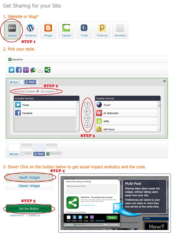
Before we start the actual tutorial, let's first get the scripts which make the share counters appear. Go the following link : Sharethis. Register with them and hit the "Publishers>>Get the Share Widget" tab. Select the following options on the page that appears.
1. Website or Blog? Choose website.
2. Pick your style - Third Option (Horizontal counters)
3. From the various networking sites, choose the ones which you want to have on your blog. Just use the left and right arrows to add and remove the various counters. The up and down arrows aligns your counters - which one should appear first in your list. It's pretty self-explanatory.
4. Choose the Oauth widget or Classic Widget.
5. Now, hit the "Get the button" tab and copy the scripts that are generated to two separate text documents temporarily and name them Script 1 (Script in the top/first box) and Script 2 (Script in the bottom/second box). 
share-button-tutorial
Now, you have the scripts with you. You need to place them on your blogger template with some CSS to make it more attractive. So, let's get it done!!!
1. Navigate to "Design>>Edit HTML" and make a backup of your template by clicking on the "Download full template" link at the top of the page. Once the back up is over, search for the following piece of code.
]]></b:skin>
2. Add the following code (CSS) just above the line mentioned in step 1.
.social {
border: dashed #ddd;
border-width:1px 0 1px 0;
margin: 10px auto 10px;
display:block;
padding: 3px 0 1px 0px;
overflow: hidden;
margin-left:0px;
}
3. Next, search for the following piece of code.
</head>
4. Place the coding present in the text document Script 2, just above the line mentioned in step 3.
5. Save your template. Then, expand your template and search for the following piece of code.
<div class='post-footer-line post-footer-line-1'/>
6. Add the following piece of code just below the line mentioned in step 5.
<b:if cond='data:blog.pageType == "item"'>
<span style='font-size:20px; font-family:Georgia; font-style: italic; line-height:21px; margin-top:1px; margin-bottom:-2px;'>Enjoyed the article?</span>
<div class='social'>
<div style='margin-left:10px; margin-top:0px; margin-bottom:3px;'>
YOUR SHARE THIS CODE FROM SCRIPT 1
</div>
</div>
<div class='clear'/>
</b:if>
7. Replace the line highlighted in green with the coding present in the text document Script 1.
8. That's it! Save your template. 

Note: The counters will be visible only on post pages. If you wish to have them on all the pages, then remove the first and the last line in the coding mentioned at step 6.

I would like to point out one advantage with this counter which is better loading time. That is, you get all the counters at one place. So, it saves a lot of time in loading your scripts. Hope you enjoyed this post. Share your opinions about the counter/post via comments!

Alexa Rank Vs. Google PageRank (PR)

alexa-rank-vs-google-pr
There's always a confusion when it comes to Alexa Rank and Google PageRank. Many of you would have gone through so many articles about the same on the web. Yet, you would not know on what basis they ranked us or how they generated the ranking for us? This time let's be clear about what to worry and what not to?

From the very beginning of my blogging experience, there is always a big question mark about Google PR. Their algorithm seems to be Greek and Latin to me. Well, even those could be understood I think. Moreover, I would like to bring to your notice that my site few months before, on the blogspot URL had a PR4 which dropped to PR0 once I made the shift to a custom domain. Interestingly, I found that one of my article namely, Increase Traffic To Your Blog With Meta Tag and SEO, still has PR2. So, this definitely confuses me. I'm sure many of you would face similar kind of problems when it comes to the PageRank.

On the other hand, Alexa Rank, as far as I know is based only on one factor - traffic. This simply means that more the amount of visitors to your site, better will be your ranking. However, few people complain that the rankings are biased between the ones who have their toolbar installed on the sites and the ones without it. I'm not sure how far this is true, but personally I did see an improvement on installing their site widget. 

I would rather see the widget as a tracking device. Just as Google Analytics asks you to install a script for working out your site statistics, Alexa asks you to install their widget for better results. Moreover, I personally noticed that when you update your site on a regular basis, your Alexa Rank would improve. Let's just list out our conclusions.
  • Alexa do not penalize websites whereas Google might.
  • Alexa Rank is purely based on traffic whereas Google PR depends on its algorithm.
  • Alexa Rank may vary from millions to as low as 1 whereas Google PR uses a floating number algorithm to rank a website on a scale of 10.
  • Other factors that contribute to Alexa Rank apart from traffic - their toolbar.
  • Other factors that contribute to Google PR apart from back-links - Page Speed and other unknown craps understood by SEO geeks.
Many advertisers except those text-link advertisers have started to look for Alexa Rank rather than Google PR which according to me, is a good strategy. So, should you be bothered about these ranks? Well, certainly not. Bottom line, just worry about the amount of traffic to your site. The rest will follow you!!! Share your knowledge about PR and Alexa Rank or an opinion about this post via comments. We would love to hear from you!

To know more about PR & back-links, check out these:
Article One - How to increase the page rank of my blog?
Article Two - How to increase back-links to my blog???

Shoutmeloud Thesis Theme Customization - Part 4

Thesis-Theme-Customization
It's been quite some time we posted about the customizations on Shoutmeloud thesis theme. So, we thought to provide one now. If you had missed the earlier series, then I recommend you to check out the various parts here - Part 1, Part 2 and Part 3. Well, this post deals with the issues related to block quotes and the text background color on hover in the post area.

Still confused about the changes which I highlighted earlier in this post? Just take a look at the following pictures to understand what changes have me made to the template and what will you achieve by following the tutorial in this post.
initial-blockquote-thesis-theme
INITIAL BLOCK QUOTES ON THESIS
blockquote-thesis-theme-new-look
THE NEW LOOK FOR BLOCK QUOTES
initial-link-hover-thesis-theme
INITIAL HOVER EFFECT ON LINKS
link-hover-thesis-theme-new-look
THE NEW LOOK FOR HOVER EFFECT ON LINKS
I think you now have an idea about the modifications we made on the template. You may check out the live demo about this hack on this article here - LIVE DEMO. So, let's get started with the tutorial on installing these effects on your blog. Navigate to "Design>>Edit HTML" and make a backup of your template by clicking on the "Download full template" link at the top of the page.

BLOCK QUOTE INSTALLATION
1. Once the back up is over, search for the following piece of code.
.post blockquote{
background:#007EC4;
margin:0 25px 15px;
padding:10px 20px 0 15px;
border-top:1px solid #DDD;
border-right:1px solid #666;
border-left:1px solid #DDD;
border-bottom:1px solid #666
}
2. Replace the above block of code with the following piece of code.
.post blockquote{
background: url("https://lh5.googleusercontent.com/-jSdcOvnlXUM/TfIHdrUoW5I/AAAAAAAABDw/Gv9rx8-QGuE/s800/blockquote.png") no-repeat scroll 5px 0 transparent;
font-size: 14px !important;
padding: 0 30px;
border-left: 0 none;
color: #9E9E9E;
font-style: italic;
margin: 2px 0 13px;
}
3. Save your template. That's it! Pretty simple, isn't it?

To make the block quotes actually work on your template, you need to use them in your posts. To do so, just mark the text which you want to appear as quotes and press the "Quote" icon -block-quote-on-blogger-post-editor-on the blogger post editor. That's it.

LINK HOVER EFFECT INSTALLATION
1. Search for the following piece of code.
]]></b:skin>
2. Place the following piece of code just above the line mentioned in step 1.
.pos-links a {
text-decoration: underline;
}
.pos-links a:hover {
text-decoration: none;
background-color: #0F4F7E;
color: #FFF;
}
.pos-links img{
text-decoration: none;
background-color: #FFF;}
.pos-links img:hover{
text-decoration: none;
background-color: #FFF;}
3. Save your template.
4. Navigate to your "Settings>>Formatting" page. Scroll down to the end of that page. In the field which says "Post Template", you will find an empty box next to it. Just paste the following code in that empty space.
<div class="pos-links">
</div>
5. Save your settings by hitting the "Save Settings" tab at the end.

By default, the upcoming articles on your blog will have the link hover effect. If you wish to have the same for your previous articles as well, then you need to edit your posts... However, you just need to add only only one tag at the start and end it at the last. So, it shouldn't be a tedious job provided you have lesser number of posts on your blog.

To edit your posts and have the link hover effect on your previous entries, navigate to "Posting>>Edit Posts" page and select the article which you want to edit. Just simply add the following tag at the start of the article.
<div class="pos-links">
Scroll to the end of your article. Close the div tag by adding the following tag at the end of your article.
</div>
That's it!! Nothing else!!!

If you wonder why I did not change the CSS for the post section and I went on with the alternate method to add individual div tags on each article, well the answer is simple. If I add these hover effects to the post section, then the images, social bookmarking icons above the posts, about the author widget and everything that comes under the post section will get affected. So, the only solution was to add the tags individually to the post.

I hope you understood the reason behind adding individual tags to each post. If you have any other alternative method, then let me know and we can discuss about that. Your opinions are always welcome - share it via comments. See you soon with another interesting customization!

Stylish Featured Content Slider For Blogger

Featured-Content-Wordcloud
It's been few days since I modified my template. Many people loved the new look while few highlighted mistakes which I'm rectifying from time to time. I found that many people loved the smooth sliding featured content on home page - recently removed for increasing the page speed. Want a slider running on your blog? Then, let's get started...

A LITTLE MORE ABOUT THE SLIDER
The slider works on jQuery and the styles are incorporated with a little CSS. The slider does feature a stop/start button and the animation goes a little farther than simply sliding to the left. Although I have modified the slider to my recommendations, the credit actually goes to "css-tricks.com". 
WHY THIS SLIDER???
The basic reason behind choosing this slider rather than the ones available on various other sites is that it occupies the least space on our blog and can be the JavaScript files can be defined internally on blogs which indirectly means that your site will load faster even with the scripts installed - no HTTP requests from the JavaScript file hosting sites. Secondly, it is more feasible and runs perfectly the same on all the web browsers. Finally, it is very easy to understand and customize the coding.

GET THIS INSTALLED ON YOUR BLOG
Let us split the customization into two parts. The first one deals with the CSS and JavaScript installation while the second part deals with the HTML coding. Now, let's get started with the first set of installation procedures.
1. Navigate to "Design>>Edit HTML" and make a backup of your template by clicking on the "Download full template" link at the top of the page. Once the back up is over, search for the following piece of code.
</head>
2. Download the following text document - JAVASCRIPT FOR THE SLIDER and paste the code present in it just above the line mentioned in step 1.
Note: The code which you pasted now, is the internally defined JavaScript that makes the slider work. The only possible customization here could be the timer which is by default set to 4000 milliseconds. You may vary it by changing the number in the following piece of code.
var delayLength = 4000;
3. Next, search for the following piece of code.
]]></b:skin>
4. Paste the following piece of code just above the line mentioned in step 3.
#slider{background:#fff url(https://lh6.googleusercontent.com/-ZnqHeWEnlfc/TeeanqTM9aI/AAAAAAAABCM/iDzYJsrifRg/s800/slider-bg-new-1.jpg) no-repeat; height:180px; overflow:hidden; margin-top:-3px; margin-bottom:7px;  position:relative; width:600px; border:1px solid #ddd}
#mover{width:2880px; position:relative}
.slide{padding:40px 30px; width:600px; float:left; position:relative}
.slide h1{color:#444; font-size:22px; font-family:Georgia,"Times New Roman",Times,serif; line-height:23px;  font-style:bold; font-weight:normal; margin-top:-25px;  margin-bottom:-8px;  color:#ac0000}
.slide p{color:#555; font-family:Georgia,"Times New Roman",Times,serif; font-size:15px; line-height:20px; width:370px}
.slide img{position:absolute; top:20px; left:420px}
#slider-stopper{position:absolute; top:1px; right:20px; background:#ac0000; color:white;  padding:3px 8px; font-size:10px; text-transform:uppercase; z-index:1000}
Note: The above mentioned code represents the CSS part of the slider. You may customize it the way you want. Various possible customizations include changing the width of the slider or the background picture of the slider. The font style can be varied to match the fonts present in your blog. I feel these are pretty self-explanatory.
5. I recommend you to save your template temporarily.

HTML PART OF THE CODING
1. Search for the following piece of code in your blogger template. Use CTRL+F to fasten your search results.
<b:section class='main' id='main' showaddelement='no'>
2. Paste the following piece of code just above the line mentioned in step 1.
<b:if cond='data:blog.homepageUrl == data:blog.url'>
<div id='slider' style='margin-left:5px;'>
        <div id='mover'>
              <div class='slide' id='slide-1'>
                        <h1>Review On Camera</h1>
                      <div style='text-align: justify;'><span style='font-family:verdana; color: rgb(0, 0, 0);'><p>This Digital Camera comes with 12.1 Mp lens and great performance with tonnes of features. One of my friends purchased this camera and got it delivered few weeks before, after having a thorough analysis read in many websites about digital camera. First of all, lets talk about the package contents which includes...</p></span></div>
                        <a href='http://www.newbloggingtipz.com'><img alt='learn more' src='https://lh4.googleusercontent.com/-WJaGQt_oYVY/TeeanGUQIJI/AAAAAAAABCI/cqEc0X10I6g/s800/read-more.png'/></a>
                </div>
                <div class='slide' id='slide-1'>
                        <h1>Review On Blackberry Storm</h1>
                       <div style='text-align: justify;'><span style='font-family:verdana; color: rgb(0, 0, 0);'> <p>The new Vodafone&#8217;s BlackBerry Storm has stormed the market and has attracted the whole world. BlackBerry&#8217;s parent company says that this phone is something that will really compete with an iPhone. So, here goes an elaborate review about the phone. The Storm has a clickable touch screen, which is really...</p></span></div>
                        <a href='http://www.newbloggingtipz.com'><img alt='learn more' src='https://lh4.googleusercontent.com/-WJaGQt_oYVY/TeeanGUQIJI/AAAAAAAABCI/cqEc0X10I6g/s800/read-more.png'/></a>
                </div>
        </div>
</div>
</b:if>
3. Now, you need to vary the content and the titles along with the link to which they should point to. To do so, you need to vary the text highlighted in green. Just copy a snippet from your blog post or write an attractive one that will drive the readers to click the read more button.
4. Next, to change the title of your post, you need to  change the text highlighted in orange. Just erase the ones highlighted in orange and write the title of your posts. The last customization would be the links to which they should point to. To get this done, replace the link highlighted in pink with the URL of your posts. That's it!!!
5. To add more posts on your featured content widget, just add the following piece of code before the last two div tags and repeat the steps from 1 to 5 mentioned above.
                 <div class='slide' id='slide-1'>
                        <h1>TITLE OF YOUR POST</h1>
                       <div style='text-align: justify;'><span style='font-family:verdana; color: rgb(0, 0, 0);'> <p>WRITE YOUR CONTENT HERE</p></span></div>
                        <a href='URL TO YOUR POST'><img alt='learn more' src='https://lh4.googleusercontent.com/-WJaGQt_oYVY/TeeanGUQIJI/AAAAAAAABCI/cqEc0X10I6g/s800/read-more.png'/></a>
                </div>
6. Now, save your template and view your result. In fact, I recommend you to preview your results before you save them.

Note: The featured content will appear only on the homepage of your site. If you wish to have it on all your pages, then remove the first & the last line in the HTML part of your coding mentioned at step 2.

I hope I made this tutorial look simple and I assume that you enjoyed this post as well. If you feel it's difficult or face any problems during the installation, then you can always reach me via email and get your slider fixed. Please share your opinions about the posts via comments. See you soon in another interesting article!!!

The All New Blogger Dashboard and Design

blogger-in-draft-redesigned
Blogger today released the new design & interface for its dashboard which can be realized only on Blogger In Draft. It's a common methodology that is adopted by Google to test the new interface on Blogger In Draft and later, update to the main site. Note that this update will be visible only to a few randomly picked users while the rest will be updated soon!

MORE ABOUT THE NEW DESIGN
It is clearly stated that there is no activation or sign-up process is required to get the new UI (User Interface) for your dashboard. Fear not, you will soon be updated with new interface - probably within a couple of weeks time. First reason why you did not have the new design - may be your blog is very new. Second Reason - Since the update is a complete redesign from the scratch, it becomes very difficult for the blogger team to make the new UI available to all its users. You may read more about the new UI here - Official Blogger Blog.

PROS AND CONS
The new design looks more sleek and takes very little time to load when compared to the age old blogger editor. The second advantage with respect to the new design is the ability to translate or define within the post editor using the Define/Translate icon. A number of issues have been solved while the other features which are yet to come are as follows.

Updates to previous issues:
  • The “You have unsaved changes” error message after post publishing has been fixed.
  • The Labels button now changes status after labels get added. We've also added the labels list and “Click to add” function.
  • We've added the “Number of posts to show in one page” option.
  • We've fixed the “Back to Blogger” link on the Template Designer.
  • We've updated scheduled posting.
  • We've fixed the Javascript error on the image uploading from Edit HTML tab of Pages.
  • We've also made a variety of other small updates to the user interface.
A few things we're still working on:
  • The option to Show/Hide blog list on Global Dashboard.
  • Label auto complete.
  • Various updates to the user interface.
  • Small images embedded in the post, such as “Tweet this” or “Email this,” are enlarged and show up on the Dashboard.
Regarding the cons, the biggest disadvantage which I felt was the inability to edit our template. The only way to do so would be to download the template, make the required changes and upload the stuff back again. Another important feature that I repeat in my feedback forms to Google is about the comments section on blogger. I feel they should modify their algorithm to support threaded comments like WP blogs.
Blogger-New-Dashboard
NEW BLOGGER DASHBOARD, CREDIT : OFFICIAL BLOGGER BLOG
The post on Official Google blog says that "We’ve essentially rewritten the entire application from scratch, using the latest web technologies that will enable us to make future updates in more agile and flexible ways. We realize there might be some ‘rough edges’ but fear not, we’ll be continually updating and improving the experience until it’s ready to graduate from Blogger in Draft. So, let's keep our fingers crossed and wait for the best to happen.

You may send a feedback about the new UI to Google via the following form - Send Feedback. You might very well share the same with us via comments.

UPDATE
Read more about the new feature on this page - ONE CLICK FAVICON INSTALLATION. Scroll to the end of the article to find the updated version of the post.

Why To Add Google +1 Button For Blogger?

Google-Plus-One-Button
It's been quite few weeks since the launch of Google +1 button. I'm sure many of you would have added this share button on your blogs. If you have no idea about what I'm talking about, then let me elaborate a little more - Google +1 button is share counter similar to facebook or tweet button that improves our search results.

HOW TO ADD GOOGLE +1 BUTTON FOR BLOGGER???
As per Google, the +1 button is defined as shorthand for "this is pretty cool" or "you should check this out". What should I do to get this button installed on my blog? Just follow these instructions to get the button working on your blog.

1. Navigate to "Design>>Edit HTML" and make a backup of your template by clicking on the "Download full template" link at the top of the page. Once the back up is over, search for the following piece of code.
</body>
2. Place the following piece of code just above the line mentioned in step 1.
<script type="text/javascript" src="http://apis.google.com/js/plusone.js"></script>
3. Next, you may place the following piece of code anywhere in between your body tags where you want the button to appear. It is better you place it below your posts. So, search for the following tag.
<div class='post-footer-line post-footer-line-1'/>
4. Place any one among the following pieces of code just below the line mentioned in step three as per your size requirement.

    For a SMALLER VERSION (15px)
<g:plusone size="small"></g:plusone>
    For a MEDIUM SIZED VERSION (20px)
<g:plusone size="medium"></g:plusone>
    For a LARGER VERSION (60px)
<g:plusone size="tall"></g:plusone>
    For the STANDARD VERSION (24px)
<g:plusone></g:plusone>
WHY GOOGLE +1 BUTTON???
  • Google clearly stated that the +1 button provides a stamp of approval meaning to say that your content is worth reading. More over, it states that it improves your search results. 
  • We blogspot users have the slightest advantage of better ranking on Google than our competitors like wordpress.com (not .org), joomla,etc... With the +1 button installed, it pushes your blog ranking further to the top.
  • When a particular user searches for some content on Google with his/her account signed in, the search results will be annotated with the names of their connections who have +1'd the page. This simply means that the recommendations from their social connections appear beneath the search results. 
  • More over, the +1's are public by default so any user who has signed in will be able to see the recommendations. How ever, you may choose whether or not, to have them displayed on your public profile.
  • The +1 Button is not the same as Google Buzz, though they share a lot of similarities. They both appear on your Google Profile under different tabs, but +1's don't allow for comments whereas Google Buzz does. 
  • Above all, Google will soon launch an analytics for the button that will display accurate results to the webmasters about their content, overall search impacts, geographic search impacts, etc...
You may get more updates about this button by joining the following group - Subscribe to Google Publishers Button. I hope you enjoyed this post. I'm sure many webmasters would know more than what I know about this topic. So, please share your opinions via comments.
[netinsert=0.0.1.11.14.1]